Back in April I posted data on three indicators of “influence” for ~400 science-focused Twitter users – based on David Bradley’s list of “Scientific Twitter Friends.” Intrigued to see how these Tweeps’ influence evolves over time, I will be updating these data periodically.
In this first update (aided and abetted by @ruthseeley – thanks Ruth!), the overall number of followers (both primary and secondary) of the SciTweep cohort has increased over the past two months – as would be expected given increasing interest in Twitter. There is the slightest hint of an increase in overall Social Capital. But this is marginal, suggesting that SciTweeps are not deviating substantially from Twitter-wide trends in increasing followers.
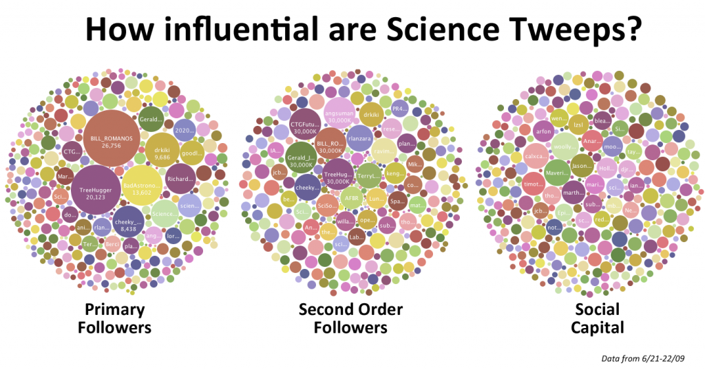
These data are available on Many Eyes to play around with (see the screencast below for tips on how to mess around with the bubble chart). You can even download the original data here and dive deeper into it…
The dataset is reasonably large and no doubt holds a multitude of insights for those dedicated to mining it (although with only two date points, it is still lacking in depth). But rather than go into deep analysis here, I thought I would restrain myself and simply focus on the distribution of the three indicators amongst the group, and changes over the past two months. (Details on the three indicators of “influence” are covered in the April SciTweet blog).
In looking at these figures, please bear in mind that the group of ~400 Tweeps is one of convenience – it does not represent all current science Tweeps, and indeed overlooks some key figures in the Twitter community. But for the purpose of following a group of science-focused Twitter users over time, it serves its purpose well.

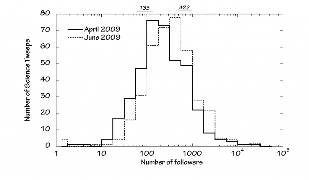
Number of SciTweeps (vertical) versus number of followers (horizontal). Watch out for the logarithmic x-axis!
Looking at SciTweep followers, there has been a shift in the modal number of followers from 133 in April to 422 in June – although these figures are approximate given the step-size used. Clearly though, there’s been an increase in the number of people following most of our SciTweets.

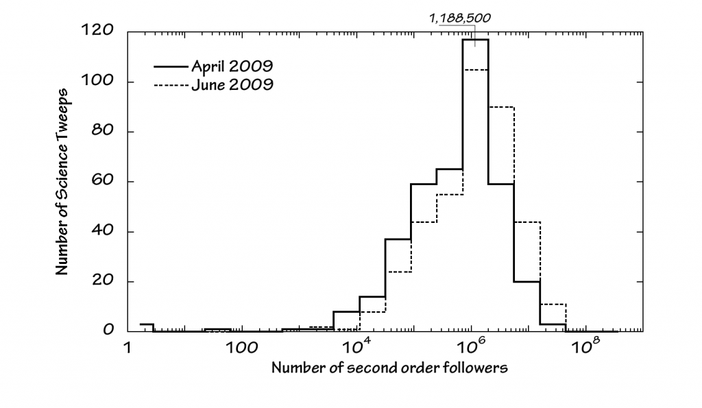
Number of SciTweeps (vertical) versus number of secondary followers (horizontal). Watch out for the logarithmic x-axis!
There has been an overall increase in secondary followers over the past two months, although not sufficient to lead to a definite increase in modal value in the plot above.
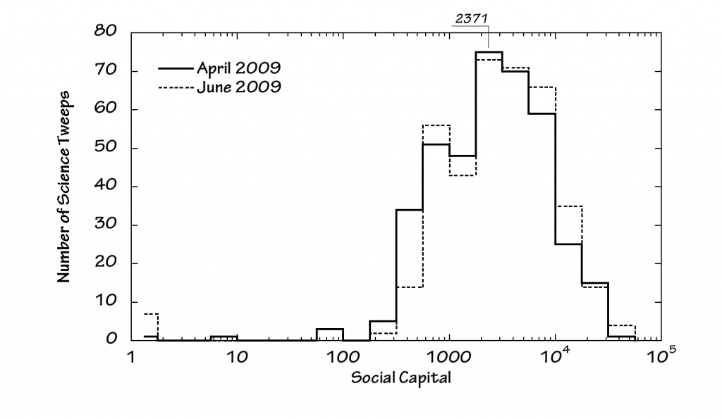
The social capital distribution has barely shifted over the past two months. As this is based on the ratio of a SciTweep’s secondary to primary followers, it provides a measure of how the SciTweeps are faring compared to the rest of Twitterdom. A significant shift to the left or right would suggest the cohort of science Tweets loosing or gaining influence compared to other Tweeps. Given the similarity between the two distributions above though, it seems that the SciTweeps are holding their own, but not showing appreciably different changes in influence compared to other tweeps.
Finally, I thought it worth posting a quick screencast of how to navigate round the bubble charts on Many Eyes. Enjoy:
[flashvideo file=/movies/20090623/SciTweet_Influence_June09.flv image=movies/20090623/SciTweet_Influence_June09.jpg width=590 height=682 /]
Update 6/23/09: Bubble Charts updated with correct data for @maverickny (formerly – and erroneously – listed as @maverick_NY)
Notes:
The data shown here are derived using Twinfluence.
Where the number of second order followers topped out on Twinfluence, it was capped at 30,000,000
My thanks to David Bradley for compiling the list of “Scientific Twitter Friends” in the first place. This is largely a self-selected list of science-types on Twitter, and in no way represents the full scientific community there. But it does provide a highly useful cohort of people who profess to have a science-perspective, and can be tracked over time. This series of analyses uses the list as it stood mid-April.
A quick word on the plots: These are a rather crude way of presenting the data, but provide a good qualitative indication of distributions and trends. The number of science Tweeps represented by each step in the plots represents the Tweeps with primary followers, secondart followers or social capital lying within the range of the step. As the horizontal axis uses a logarithmic scale, the range of values covered by the steps increases dramatically going from left to right. As the data are roughly logarithmically distributed, this makes visualizing, comparing and analyzing the numbers easier. But care should be taken when interpreting the plots, given the logarithmically compressed horizontal axis. In particular, modal values are dependent in part on the use of a log-axis, and would be different if the data were plotted with a linear horizontal axis.
And finally, many thanks to @ruthseeley for help in running SciTweeps through Twinfluence – a finger-numbing task!


Thanks for your continued interest and fascinating analyses of the scientwists. The list has gone past the 500 mark and is still growing, although I haven’t publicised it much recently. I wonder whether there’s any way to tease out the influence just being on the list has had on the reach and followerships of the members of the list.
I gave the list a mention in an interview I did with Chemical & Engineering News at the beginning of the month and saw a little spike in activity.
Keep up the good work.
db
Happy to assist. That’s five thank yous now. I’m reserving some time in September so I can do more next time. Wanders off muttering about honey and vinegar and flies. 😉
Hi–you still are missing an important tweep–@maverick_ny is wrong, it should be @maverickny, Sally Church. It was corrected in David’s post.
Mary
My apologies – I’ve updated the information on Many Eyes, and the links to the corrected dataset and bubble charts.
Thanks for spotting this!
Great job on the analysis, Andrew! So often we see these flimsy, hand-waving analyses, but here you’ve got real data. Nice!
Thanks! Just need to work out what it all means now…
Interestingly, David Bradly at ScienceBase (@sciencebase) and I posted separately trackable links to the post above on Twitter yesterday – at around the same time. Looking at the Twitter-specific hits we both received over the past day and comparing it to the indicators of influence is interesting:
Hits from @sciencebase: 309
Hits from @2020science: 141
Ratio: 2.19
Ratio of primary followers: 1.06
Ratio of secondary followers: 2.41
Ratio of social capital: 2.26
You can see where I’m going here – assuming the ratio of our respective Twitter hits provides some indication of relative influence, it becomes possible to tease out the indicator of influence that is most relevant. In this case, social capital comes out on top.
Before you get too excited, this is just one datapoint, and there are a myriad other things that could have affected the result. But I thought it was interesting nevertheless.
Next challenge is developing a robust Twitter experiment to test the hypothesis that social capital is a reasonable indicator of influence…
So …is sciencebase more influential than 2020science? Tee hee….
Sciencebase and 2020science both have a similar number of followers, although 2020science’s follower to followee ratio is much higher than sciencebase. 2020science has tweeted around half the number of updates as sciencebase.
Seriously though, perhaps one of the most important confounding factors is the text of the tweet itself, the headline as it were:
“Scientists’ influence on Twitter analyzed” was sciencebase
“New blog posting, Science influence on Twitter – June update” was 2020science
Both mentioned Twitter, 2020science mentioned it was a new blog posting and an update, sciencebase simply stated what the content was without saying anything about timeliness. Not sure which is the “better” headline, the sciencebase tweet makes no suggestion that the reader may have seen it before though, that could have had an influence.
That will be an interesting experiment. I would guess that if there were slightly different foci in your previous twitter streams, it would weight your followers to follow a link on one subject over the other.
An example, your followers may have a higher concentration of people who are primarily interested in nanotechnology or even public science policy, where as Mr Bradley has a base of followers interested in science in general, or even music. A tweet about nanotech legislation may appeal to your followers more, where as a tweet about acoustics might appeal to his.
I wonder if the high likelihood that both of your groups followers enjoy participating in experiments and analysis might also weight the results.
I will be interested in hearing about the methodologies as well as the results.
David’s definitely onto something re the language used to draw people in. Of course I’ve ended up watching some YouTube videos I’d rather not have known existed, but when you’re working with only 140 characters and a (shortened) URL, every character has to count, and ‘new blog post’ or ‘blog update’ may well be (ok in my view IS) a waste of precious verbal resources. I get much better response when I ask people to look at my ‘natural platinum highlights’ than when I ask them to look at my gray hairs. 😉