Following on from yesterday’s update on my quest to track science influence on Twitter, I’ve posted a bubble-chart of the August “influence stats” for all 523 scientwists in David Bradley’s list over at Many Eyes.
Using the chart, you can quickly explore the number of followers, secondary followers, social capital and a handful of other Twitter stats on the scientwists.
The chart draws on data that Mike Chelen kindly compiled using Twinfluence.
So how do you navigate around these bubble charts, and what do they show? Here’s a quick tutorial. (for the adventurous, you can dive straight in here)…
Getting started
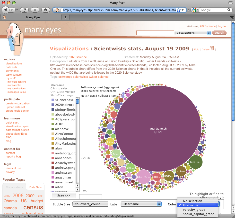
First, open this link to the bubble chart at Many Eyes. The chart on the screen shows “bubbles” representing the number of followers each scientwist has.
From the “Color” menu at the bottom right of the screen, select “Username”
The screen will now look like the screenshot above, with the scientwists listed to the left of the screen.
Finding specific scientwists
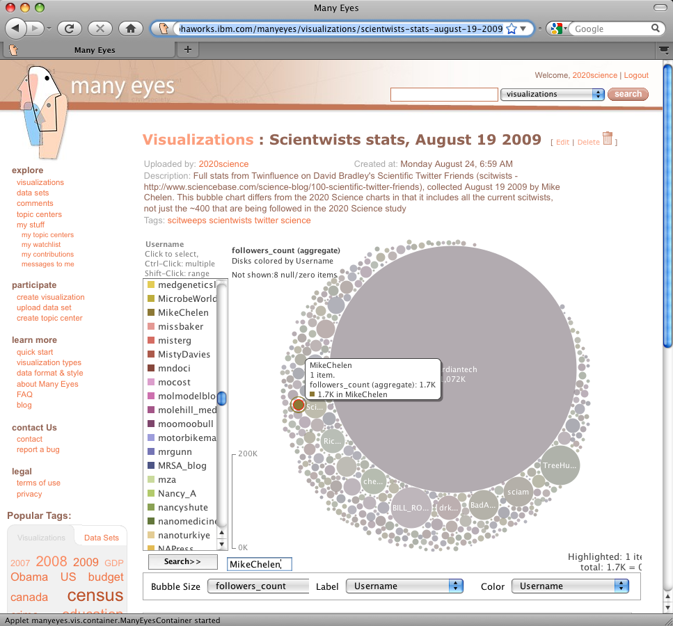
To highlight a particular scientwist, either select them from the list to the left of the screen, or type their name in the search box:
Placing the mouse over the scientwists bubble provides more information on the information being displayed.
To get back to the normal display, either click in the white space surrounding the bubble chart, or clear the search box and hit “Enter”
Showing the number of friends each scientwist has
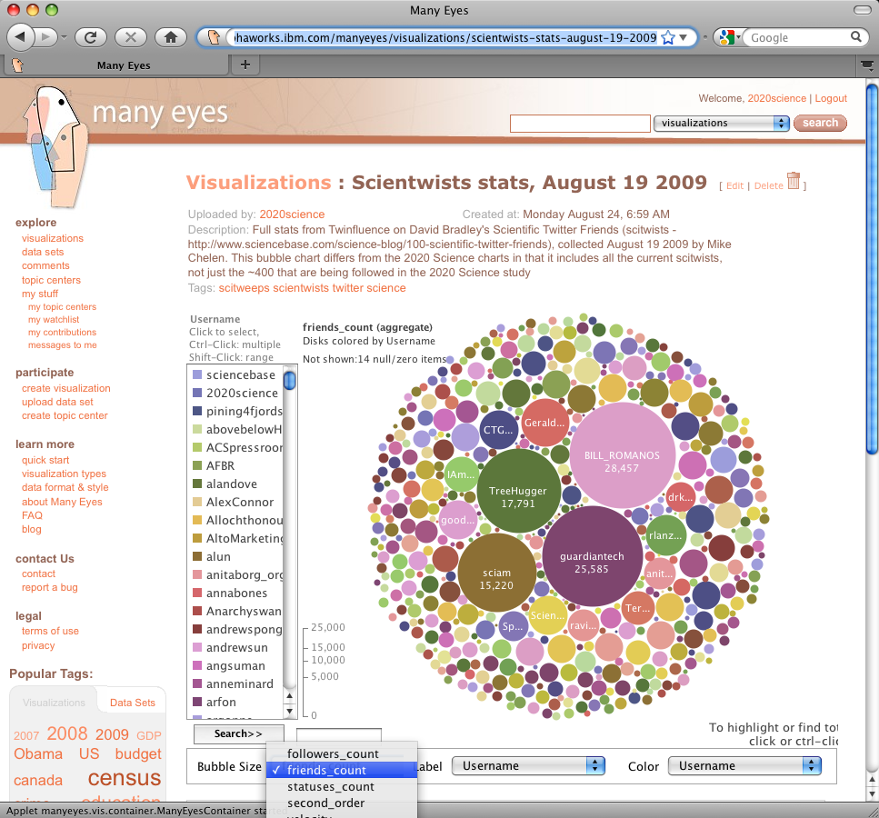
From the “Bubble Size” menu (bottom left) select “friends_count”. The bubble chart now shows bubbles with areas that represent the number of people each scientwist is following. To see the data associated with any bubble, simply position the mouse over it.

To see how many people each scientwist is following, select "friend_count" from the Bubble Size menu
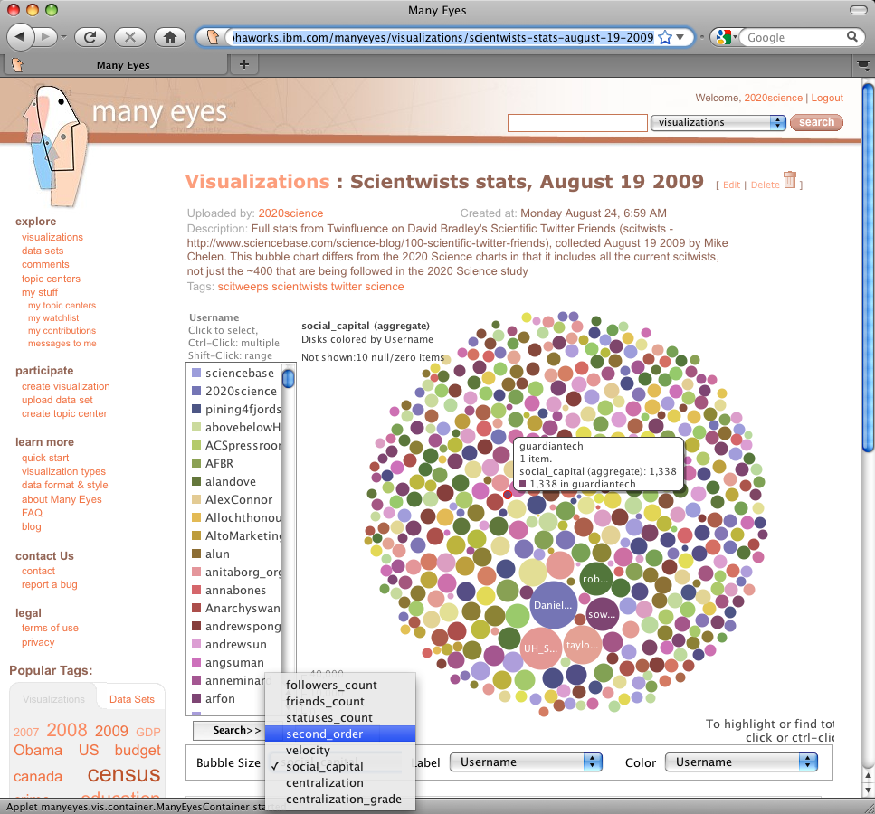
Showing second order followers, social capital, and other stats
Simply select the information you want to see from the Bubble Size menu. As well as second order followers and social capital, there are a few stats that Twinfluence provides.
Why the bubble charts?
As well as being visually attractive (I’m revealing my shallowness here), the bubble charts at Many Eyes have a couple of advantages in displaying data like these:
- Because the data are represented in two dimensions (area) rather than one (bar height, for instance) it’s a lot easier to compare large and small numbers. for instance, @guardiantech has over 200 times more followers than @2020science. On a linear plot, you wouldn’t be able to see @2020science – using the bubbles, where area represents the data – you can see both scientwists together.
- As the bubbles are displayed in two dimensions, it becomes easier to spot interesting patterns and associations.
And finally…
These data were collected by @MikeChelen using an API he wrote specifically to gather large amounts of information from Twinfluence. And while we’ve used this technique here to look at scientwists, I suspect that it could also be used to great effect to examine other groups of twitter users.


