An interesting aspect of today’s Royal Society report on geoengineering is the attempt to rate twelve potential approaches to engineering the climate by effectiveness, affordability, timeliness and safety – and to graphically compare the approaches in terms of these criteria.
While the ratings and the resulting diagram are somewhat subjective (the report’s authors call them “tentative and approximate”), they have some merit in helping make sense of a complex and uncertain bunch of data.
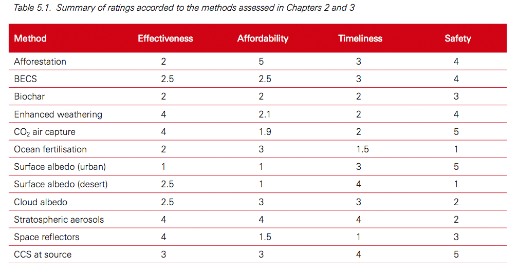
In the report, potential geoengineering approaches are displayed against primary axes of effectiveness and affordability. But as the full evaluation data are available, it’s reasonably easy to re-plot them as effectiveness against “safety.”
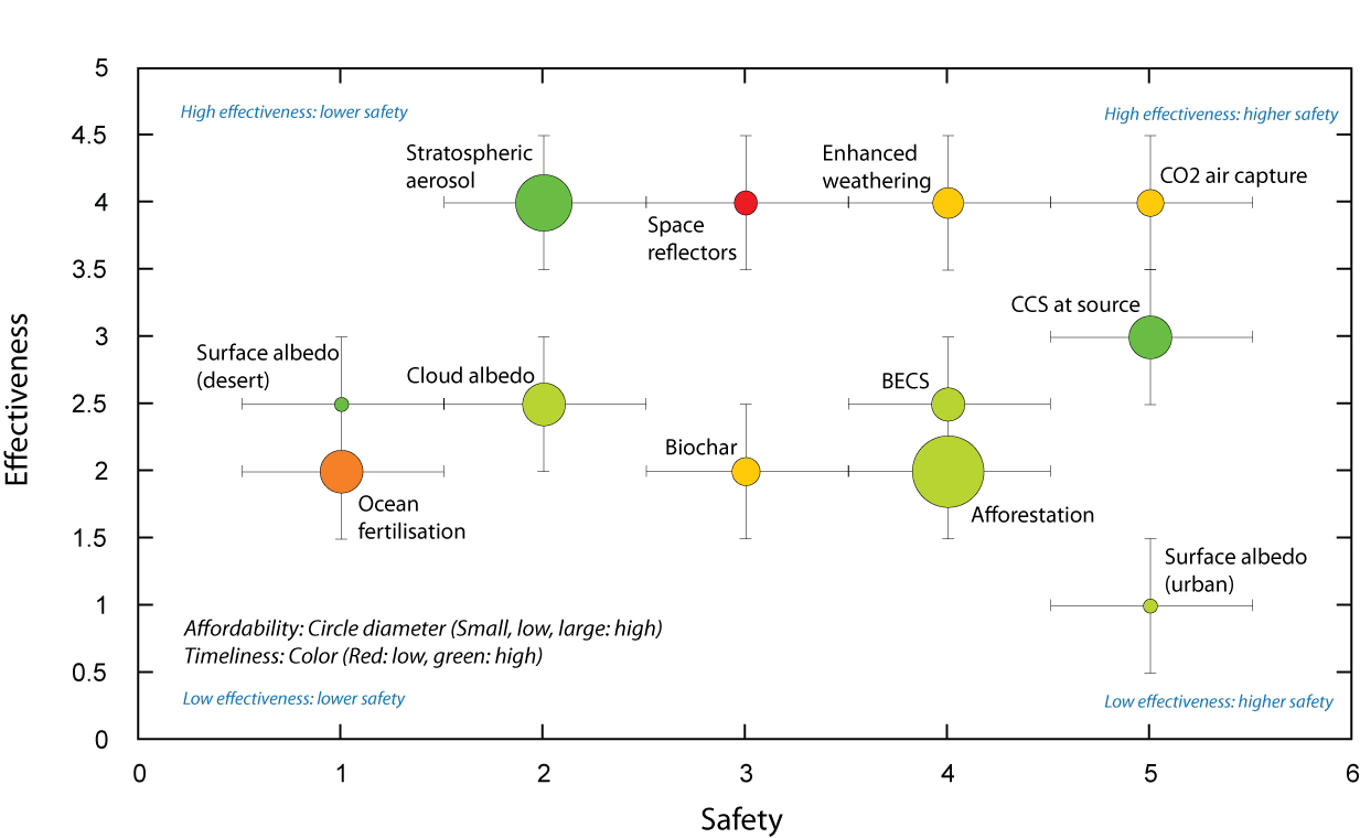
If you do this, this is what you get:

Displaying estimated effectiveness versus "safety" for twelve geoengineering approaches. Based on data in the Royal Society Geoengineering the climate report
Showing the ratings in this way, approaches such as carbon dioxide air capture and carbon capture and storage at source emerge as options potentially combining high effectiveness with higher safety. Increasing urban surface albedo – painting roofs while etc. – appears relatively safe in this assessment, but not particularly effective.
On the other hand, ocean fertilization, increasing sunlight reflection from deserts (desert surface albedo) and enhancing sunlight reflection from clouds (primarily by pumping cloud condensation nuclei into the atmosphere) combine low effectiveness with lower safety.
It must be stressed that this assessment is highly subjective, and will probably shift over time – as well as who rates the various approaches. And the concept of “safety” is a rather woolly one – a high safety rating doesn’t mean “safe” – it just means that the approach is likely to have less adverse or unintended consequences than one with a lower safety rating.
Yet even with these caveats, multi-data visual presentations like this could help to weed out the less feasible geoengineering options, and ensure the focus remains on approaches that are more likely to do good than cause harm.
Source:
The plot above is based on data in table 5.1 of the Royal Society report:


Really useful plot – thanks! I was groping toward the kind of conclusions depicted in this diagram, but it is much easier to see when someone has done the work to summarise it so neatly.
Thanks Jon
Hi Andrew, I was wondering how you went about redrawing the plot to look exactly like the original? thanks, simon
I was pushed for time, so I used a clunky but familiar approach – the data were plotted in Kaleidagraph, and the plot imported to Adobe Illustrator. The points were then overlaid with circles where the colors and size represented the data (done manually – I had to make a template for the different circle sizes). I then added the error bars and annotated the plot.
There are easier ways – I just didn’t have the tools and expertise at my disposal!
thanks Andrew. I feared it might have involved Illustrator!
Appreciating the persistence you put into your
website and in depth information you present.
It’s great to come across a blog every once in a while that isn’t the same outdated rehashed material.
Wonderful read! I’ve saved your site and I’m
including your RSS feeds to my Google account.