It’s the middle of August, and time for my regular two-monthly update on science tweep influence on Twitter.
Back in April I posted data on three indicators of “influence” for ~400 science-focused Twitter users – based on David Bradley’s list of “Scientific Twitter Friends.” This is the third update of the indicators – the second was back in June. This time round, Mike Chelen (@MikeChelen) was kind enough to put together an application that grabbed the data directly from Twinfluence.
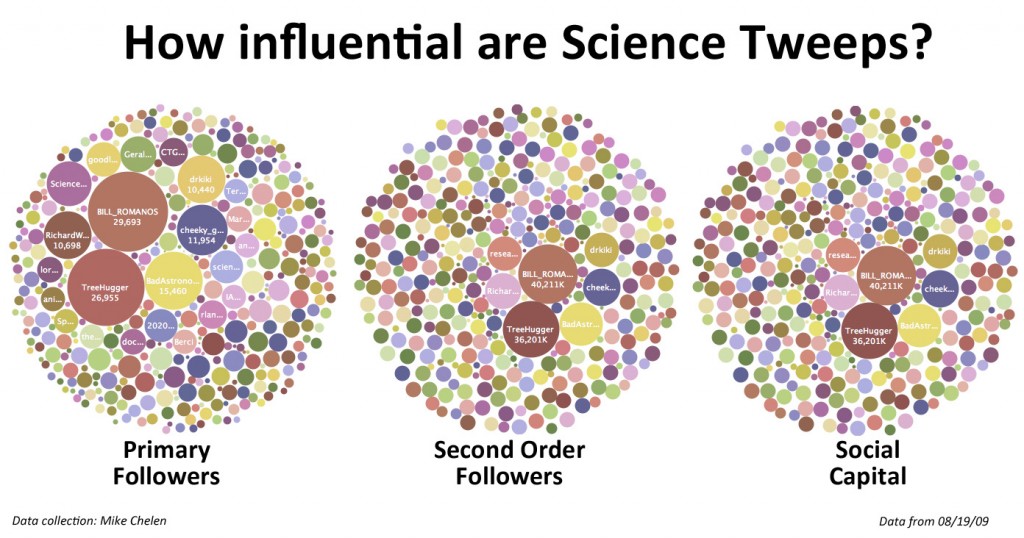
As usual, I’ve posted the data on Many Eyes to allow you to play around with it, and get a better feel for how these indicators vary with person and time. This time round though, there are separate bubble charts for primary followers, second order followers and social capital (follow the links, and select the data for August – the charts default to the April data). If you get lost, check out the screencast on navigating the bubble charts in the June update.
Not a whole lot has changed since June.

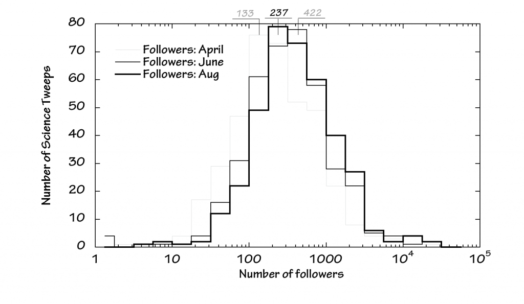
Number of SciTweeps (vertical) versus number of followers (horizontal). Watch out for the logarithmic x-axis!
The modal number of followers per SciTweep has dropped a little, but overall the distribution of followers per SciTweep hasn’t shifted too much.

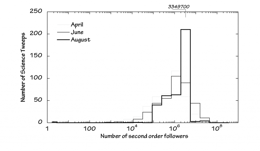
Number of SciTweeps (vertical) versus number of secondary followers (horizontal). Watch out for the logarithmic x-axis!
Perhaps the most obvious change is in the distribution of secondary followers amongst SciTweeps. This has shifted to the right slightly overall, but there are fewer SciTweeps with large numbers of secondary followers. Either some tweeps with mega-followings have been dropping SciTweeps from the people they follow, or the figures reflect a re-alignment within Twitter that has impacted the data. Either way, my number of second order followers was hit badly over the past couple of months!
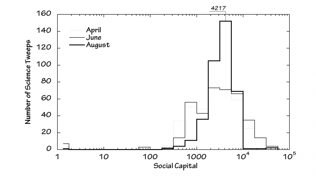
The range of SciTweep social capital values has narrowed over the past couple of months – more people with a higher social capital, but fewer with a mega-high social capital.
And that’s pretty much it for now. The plan is to have another update in October, although I may also ask for suggestions on a better way to track SciTweep influence over the long term – including thoughts on putting together a more representative group of tweeps to follow.
Notes:
The data shown here are derived using Twinfluence. The August data were collected by Mike Chelen.
Where the number of second order followers topped out on Twinfluence, it was capped at 20,000,000 in April, and 30,000,000 in June.
My thanks to David Bradley for compiling the list of “Scientific Twitter Friends” in the first place. This is largely a self-selected list of science-types on Twitter, and in no way represents the full scientific community there. But it does provide a highly useful cohort of people who profess to have a science-perspective, and can be tracked over time. This series of analyses uses the list as it stood mid-April. To preserve the group, I haven’t added new SciTweeps from David’s list.
A quick word on the plots: These are a rather crude way of presenting the data, but provide a good qualitative indication of distributions and trends. The number of science Tweeps represented by each step in the plots represents the Tweeps with primary followers, secondart followers or social capital lying within the range of the step. As the horizontal axis uses a logarithmic scale, the range of values covered by the steps increases dramatically going from left to right. As the data are roughly logarithmically distributed, this makes visualizing, comparing and analyzing the numbers easier. But care should be taken when interpreting the plots, given the logarithmically compressed horizontal axis. In particular, modal values are dependent in part on the use of a log-axis, and would be different if the data were plotted with a linear horizontal axis.


Looking at the ManyEyes data it seems some of the rows were truncated. Here is an updated copy, of August only.
If anyone wants to take a look at the recent update, everything is publicly available through this Google spreadsheet.
Thanks Mike.
I have been sticking with a sub-group of David’s scitwists so that the stats can be tracked over time – hence not every current scitwist is included in the analysis above.
For anyone interested in the impact statistics for ALL current scitwists, the relevant bubble charts are now available at: http://manyeyes.alphaworks.ibm.com/manyeyes/visualizations/scientwists-stats-august-19-2009 These are based on Mike Chelen’s unadulterated data 🙂
As you will see, one of the problems of including everyone is that scitwists like @guardiantech dominate the followers chart. Nevertheless, this is an interesting and informative way of comparing and contrasting all the current scitwists.
If you are in David Bradley’s list – check it out!
Glad my list is still of use and thanks for the name check once again. There are now well over 500 scientists on the list, which started out as 100 from my own twitter crowd back in January. Additions are now much more sporadic although people still occasionally retweet the link.
I wonder how the charts would look if everyone started using TwitBlock diligently to block spammy followers…